Logo
The Synology logo is the most valuable asset in Synology’s brand communication. It represents Synology as a whole, allowing customers to identify Synology’s products and their compatibility with third-party products. To maintain legibility and credibility, please follow the guidelines, use the logo properly, and refrain from any derogatory or inappropriate use. View the full logo library

Color
The Synology logo should only appear in our primary colors, namely black, white and particular sets of gray. Please refer to the color color palette for precise values.

Use the 2-color logo on lighter backgrounds.

Use the black logo on lighter backgrounds.

Use the white logo on darker backgrounds.

Do not use colors that are not our primary colors.

Do not use a mix of different colors.
Scale
To maintain legibility, the smallest size that you can use for our logo is 80 pixels wide on screen and 12 mm wide in print.
Clear space
The logo should be separated from other visual elements by at least a distance equal to the cap height of the letter “S”.
Placement
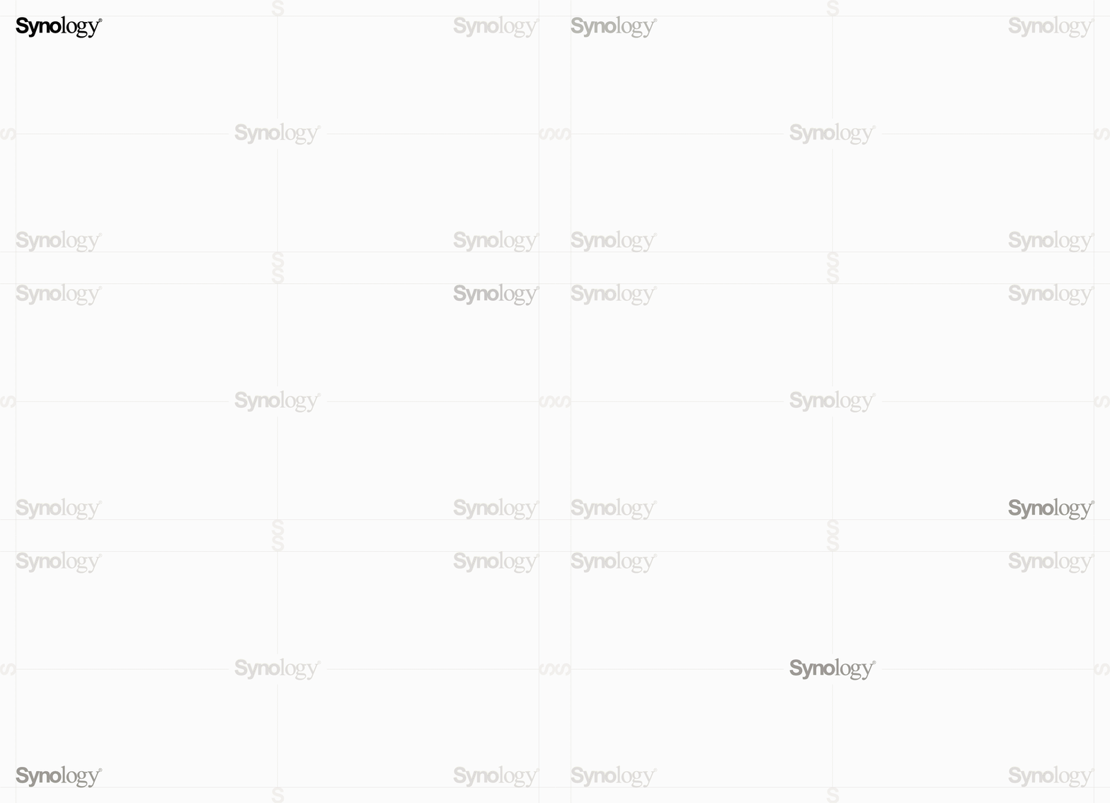
The logo should be placed in one of the four corners or the middle of compositions, depending on the design.

Guidance
Other things to avoid:

Do not stretch or compress the logo.

Do not rotate the logo.

Do not frame the logo.

Do not add drop shadows.

Do not outline the logo.

Do not add taglines.
Third-party Usage
The “Synology” logo can be used only for the marketing and promotion of Synology’s products, or displaying a product’s compatibility or optimization with Synology’s products. Please be advised that any use of the “Synology” logo that does not comply with this Guide could constitute a trademark infringement.
