Typography
Typography is one of the most important, but often overlooked, elements in the design system. Great typographic arrangements not only make reading enjoyable, but can also elevate the entire brand identity.
Typeface
Typeface is the foundation in our typography. We have chosen a few representative typefaces that reflect our style and modernity, while still remaining versatile for brand communications and maintaining a consistent brand image.
Inter
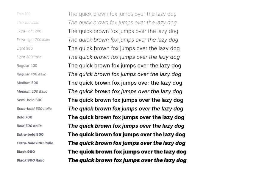
We use the open-source typeface, Inter, as our default. Inter has 9 weights, from thin to black, and 18 styles, making it suitable for various typographic usage. It is also optimized for print, web, and mobile interfaces due to its excellent legibility characteristics.

Asian scripts
For Asian scripts that are not supported by Inter, including Chinese, Japanese, Korean and Thai, we use the following typefaces:
| script | typeface |
|---|---|
| Traditional Chinese | Noto Sans TC, Microsoft JhengHei |
| Simplified Chinese | Noto Sans SC |
| Japanese | Noto Sans JP |
| Korean | Noto Sans KR |
| Thai | Kanit |
When using Noto Sans, make sure to use the corresponding family for each language, as there are may be small deviations. For example, the same character can have different stroke styles in Traditional Chinese and Simplified Chinese, and the positioning of punctuation marks may also differ in different scripts.
Spacing
Typography is all about spacing. The 4 types of spacing, in order from small to large, are as follows: letter spacing, word spacing, line spacing and paragraph spacing. These spacing types can determine the quality and entire layout of the typography.

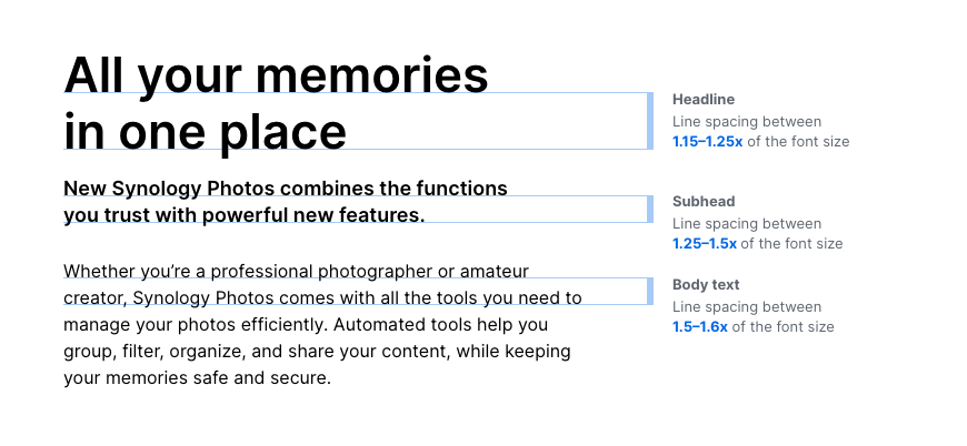
Generally speaking, the smaller the font size, the larger the line spacing should be to improve readability. Therefore, we suggest a line spacing of 1.15–1.25x of the font size for headlines, 1.25–1.5x for subheadings and 1.5–1.6x for the body of the text. These recommendation have taken language differences into account.
Spacing guidance

Proper spacing between letters and words protects readability.

Comfortable line spacing.

A proper balance between line spacing and paragraph spacing helps readability.

Letter spacing shouldn’t be too loose.

Line spacing shouldn’t be too tight.

Line spacing larger than paragraph spacing affects readability.
Line width
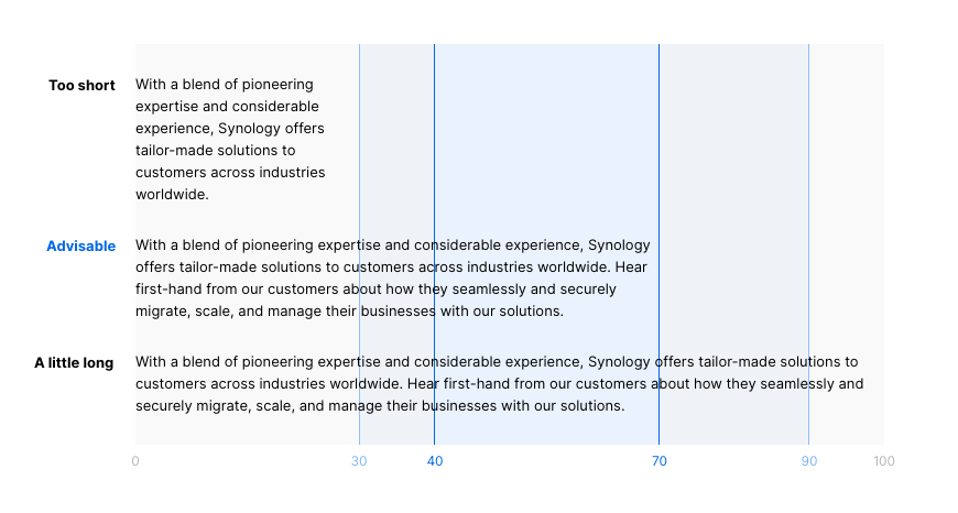
Proper line width makes reading accessible and comfortable. If the line length is too short, it could break reading rhythm. For example, with English, an advisable line length for body text lies between 40–70 character (about 7–15 words) per line.(The visual-textual coherence may also affect the length of suitable line width.)

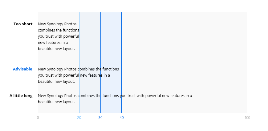
For shorter texts, we suggest to narrow the line length to around 30–40 characters (about 5–8 words) per line.

The recommendations above are based on the English language. Different languages might require tailored settings to achieve the same level of readability.
Alignment
We use two types of text alignments in our typography: flush left and centered.
Flush left
flush left creates a natural reading flow by maintaining proper word spacing without the need for additional typographic efforts.


Centered
centered alignment is effective in concentrating short typographic elements, but is not recommended for long texts.


Color
Our controlled color selection for typography protects consistency and creates a prominent style in terms of brand communications.

Primary colors include black, white, and our 2 specific sets of gray.

Pay attention to the contrast ratio between the background and text.

Use Synology blue to highlight. Increase the font-weight if needed.

Use Synology blue to indicate interactivity.

Tertiary colors are for errors and warnings.

Do not use Synology blue without reason.

Do not use non-primary colors for texts.

Do not use color gradients for texts.


