Iconography
Icons are effective design elements that can be utilized across all touchpoints to help provide a better user experience on any interface. Our icons feature two types: spot icons and system icons. Spot icons are used to support textual contents with their visual competence, while system icons are mainly used to improve the overall web experience. View the full icon library
Spot icon

System icon

Principle
Our icons are built on the following basic principles to maintain quality and consistency:
Concise
Icons are simplified in terms of form, and precise in terms of their meaning. Icons are used to support the perception of textual content, so it is best to avoid non-essential or decorative design details.
Concrete
Use literal and concrete symbols instead of abstract ones. When the concept is too abstract or complex to be fully expressed, using a related concrete object might be a good idea.
Competent
Icons can be moderately fun and accessible to peak the reader’s interest, but this could risk undermining Synology’s professional image. Make sure to keep the sense of humor and proficiency balanced when designing icons.
Consistent
Focus on consistency with established icons by following the guidelines and sharing common elements. Please refrain from creating multiple icons to represent the same concept.
Spot icon
Spot icons are content-dependent icons that can only work with textual content. These icons increase visual interest towards the concept presented and encourage focus to help guide the reader’s eyes.
Spot icons have two sizes, 32 x 32px and 64 x 64px, and two different design principles, respectively.
Spot Icon (32)
The spot icon (32) has a relatively compact design style, and is normally placed to the left of a paragraph as a visual guide for the textual content. This icon helps distinguish one paragraph from another so that the audience can grasp the content more efficiently.
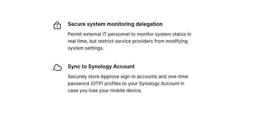

Left-align icons and text alternatively.

Scale icons proportionally.

Do not center-align icons or text horizontally.

Do not put the icon under a headline.

Do not change the visual proportion when scaling.
Spot Icon (64)
The spot icon (64) contains more details in terms of its design, making it more expressive than its 32px counterpart. This pairs well with a headline and a short text, and is effective at emphasizing important features of our products and services.
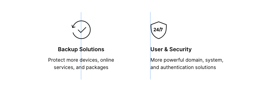

Do not put icons under headlines

Do not put icons to the left of text.

Do not use without headlines.
System icon
System icons are usually smaller than spot icons in size, and are used to add visual clarity to an interface. These icons help make user’s web experience smoother, and can sometimes reduce the amount of unnecessary information.


Place icons next to the text.

Place icons under text.

Center-align icons and text.

Do not place icons above the text.
Construction
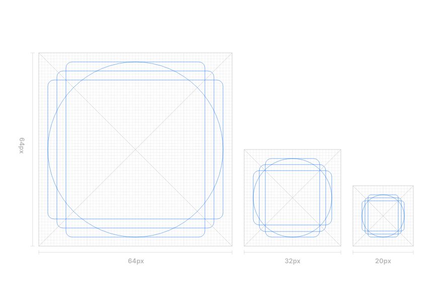
The construction of our icons is based on pixel grids of three different sizes. These grids determine not only the size of the icons, but also their padding, shape, positioning and stroke width. A pixel grid helps make the icon look better on-screen, while effectively unifying the icon system as the system scales.
Grid
Our icons are built upon the pixel grids of 64 x 64, 32 x 32 and 20 x 20px with 2px padding, respectively. Icons should normally be drawn within the live area, but we advise you to extend the design into the paddings for better optical balance.
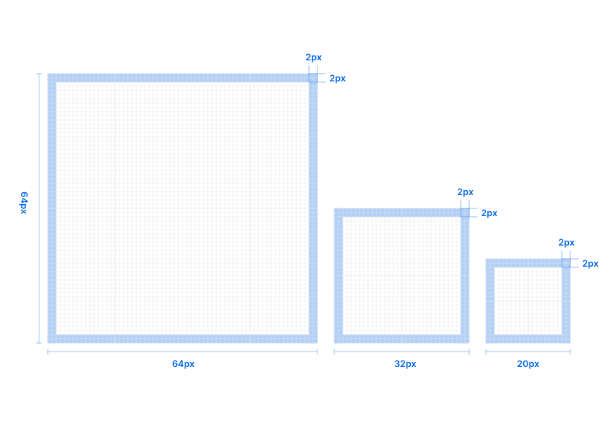

Draw icons within the live area.
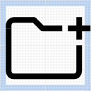
Extend designs into the paddings for better optical balance.
Keyline
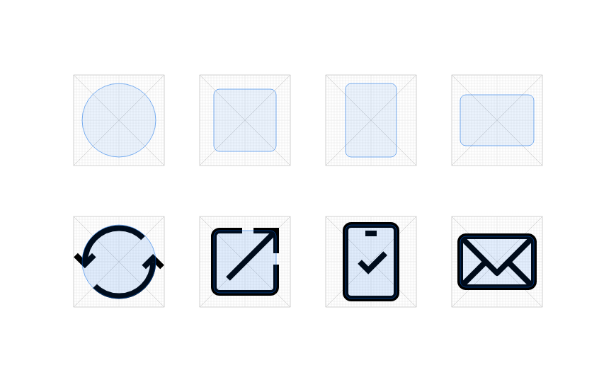
Through the use ofkeylines in our icon designs, we are able to unify the entire icon system and make it easier to scale. Keylines determine the size and area of basic shapes, such as circles, squares, and rectangles. These shapes help with maintaining consistent visual proportions across our icons.
Stroke
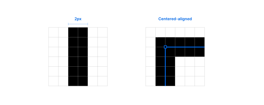
The strokes of our icons are 2px wide and center-aligned.
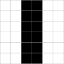
Be pixel-perfect.
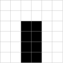
Use squared stroke-terminals.
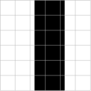
Be pixel-perfect!
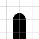
Do not use rounded-stroke terminals.
Style
Our icons are built with outlines and rounded corners to create a friendly and accessible style.
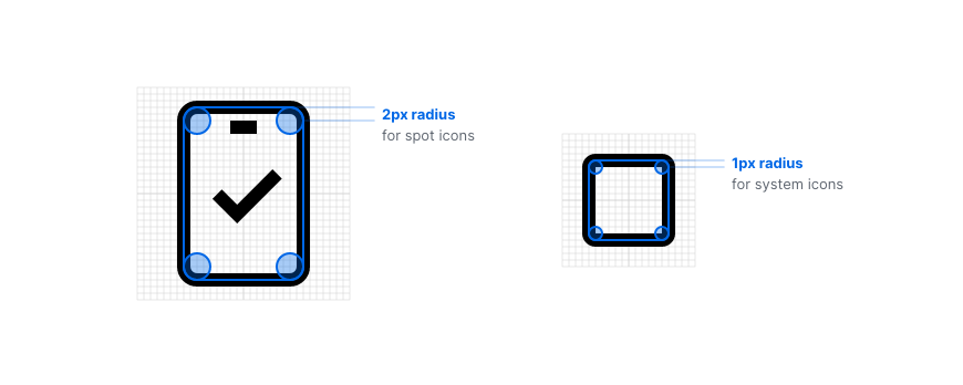

Use arrows and check marks with sharp corners.

Use filled shapes and elements for better visual balances.

Do not use arrows and check marks with rounded corners.

Icons without filled shapes can look too empty.
Angle
It is almost impossible to design icons without angles. However, to achieve consistency throughout our icon sets, opt for increments of 45º first, and flexibly use increments of 15º to complete the design.

Color
Since icons are used to aid reading and the user experience, colors should be used carefully in an effort to avoid any distractions.

Use one color (generally the same as the text color).

Use two colors to strengthen the meaning.

Don’t use more than two colors on an icon.

Do not use color to fill in an icon.

Do not use color gradients.

