Network diagrams
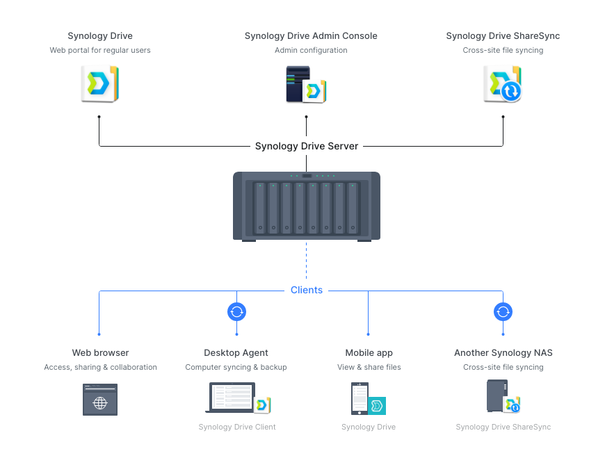
At Synology, network diagrams are effective and useful tools used to illustrate how our products play their roles in different contexts, such as with surveillance systems, in storage and backup infrastructures, or in virtual machine environments. Through the use of these diagrams, we can showcase how we lay out suitable solutions for customers with an aim to inspire those who are seeking similar results.
Types
A network diagram network diagram is a visual representation of a network, where elements and devices are connected using arrows and lines. Using this method, we can depict interrelationships between data points while also providing a clear overview of the entire network’s construction.
Synology utilizes two types of network diagrams, each used for different purposes and situations. Type A network diagrams are distinctly defined in terms of their design and are used primarily in our customers’ case studies. Type B network diagrams, on the other hand, do not employ a strict approach but are generally more visually-focused for use on web pages and publications.
Type A
With Type A network diagrams’ uniform approach, we are able to more effectively represent our customers’ unique case studies and cater to our broad customer base. Through the simplification and standardization of their design style and design elements, Type A network diagrams have been optimized to accommodate a wide variety of subjects while also maintaining a standard style across different cases.

To design a Type A network diagram, set up a canvas of 900px wide and make sure to adhere to the following rules:

Use front-view 3D rendered photos for physical product models.

Use blue shapes to indicate Synology products and services.

Use gray shapes for other devices and elements. The gray color used is “Cold gray 2”

Use package’s icons where possible. In this case, the title does not need a blue background.

The uniform font size is 15pt. Font colors can be either black or white.

The stroke weight should be 1pt for any stroke.

Use solid black lines with arrowheads to indicate relationships.

The aspect ratio of an arrowhead should be 1:2, namely ‘Arrow 8’ in Adobe Illustrator.

Always allow a space between the arrowhead and the object it is pointing to.

Use gray dashes for grouping. The gray color used is “Cold Gray 4”.

Dashes should be made up of rounded cap strokes, with 4pt stroke lengths and 4pt gaps.
Type B
Type B network diagrams are created with the intention of illustrating important features or mechanisms using specific details and creative compositions. These dedicated graphics can help integrate a diagram with the other design elements on the same page, creating a better overall viewing experience and contributing to our brand image.


